Colour selection has become one of the most underestimated decisions in new home builds and renovations. While finishes and fixtures tend to dominate early conversations, the colour palette ultimately determines how a home feels, ages, and adapts to changing households over time.
For buyers, choosing the right palette is less about chasing trends and more about understanding how colour interacts with light, layout, and long-term use. The most successful homes treat colour as a planning decision, not a final styling layer.
Start with light, orientation, and layout, not swatches
The same colour can read dramatically differently depending on orientation, ceiling height, and natural light. North-facing living areas tend to soften cooler tones and amplify warmth, while south-facing rooms can flatten darker or greyer palettes.
Open-plan layouts also require restraint. When multiple spaces flow together visually, abrupt colour changes can fragment the home and make it feel smaller. A controlled base palette allows zoning to occur through furniture, joinery, or texture rather than paint alone.
For buyers reviewing plans rather than finished homes, this is where mock-ups, digital renders, or visiting completed projects with similar orientations can be more valuable than display home colour boards.
Choose a base palette that supports longevity
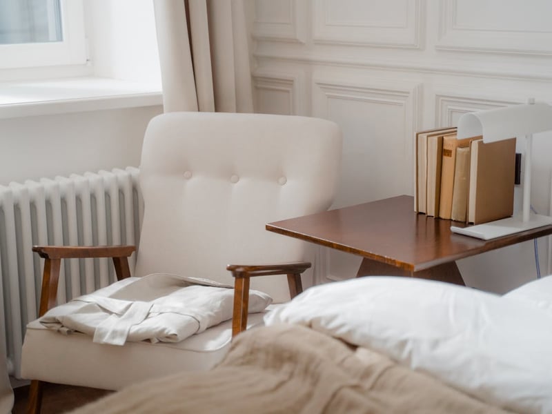
Most well-resolved homes rely on a neutral base, but “neutral” doesn’t mean white or beige by default. Warm greys, soft stone tones, muted greens, and off-whites all sit comfortably within neutral territory when they’re grounded and low in contrast.
The key consideration for buyers is flexibility. A restrained base allows future owners to update furniture, artwork, or soft furnishings without reworking the entire home. This is particularly relevant for family homes, where uses and occupants often change faster than finishes.
Bold colours are rarely the issue; permanent bold colours in high-coverage areas are.
Common colour palettes buyers are choosing, and why they work
Rather than focusing on fashion-led schemes, these palettes appear consistently in homes that prioritise longevity, resale resilience, and day-to-day comfort.
Warm neutral palette
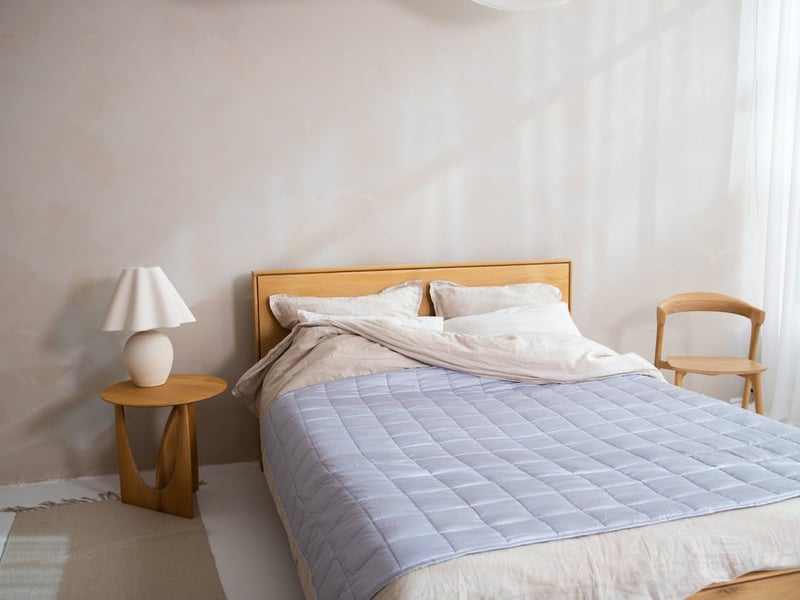
Off-whites, soft beiges, pale taupes, and light timber tones form a calm, adaptable base. This palette suits open-plan homes and works well with natural light, making it a frequent choice for owner-occupiers who want flexibility over time.
Soft contemporary palette
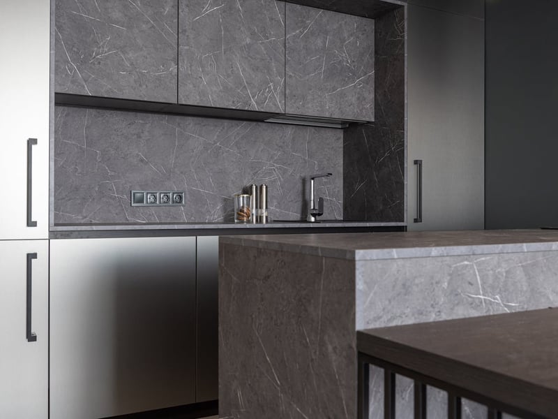
Light greys, muted charcoals, and warm whites paired with restrained black or dark joinery accents. This approach suits modern builds and townhouses, particularly where clean lines and structured layouts dominate, without locking the home into a stark aesthetic.
Natural earthy palette
Muted greens, warm stone tones, clay-inspired neutrals, and timber finishes. Often chosen for homes focused on connection to landscape or indoor–outdoor living, this palette tends to age well because it references materials rather than trends.
Monochromatic tonal palette
A single colour family used in varying depths, for example, layered greys or warm whites. This approach works particularly well in compact or narrow homes, where visual continuity helps spaces feel larger and more cohesive.
In each case, success comes from limiting contrast and repeating tones consistently across living areas.
Use colour to support function, not just mood
Different areas of the home benefit from different colour behaviour. Bedrooms tend to respond well to calmer, lower-contrast palettes that reduce visual stimulation. Kitchens and living areas, by contrast, can tolerate stronger tonal variation, particularly when balanced by natural light and materials.
Bathrooms and laundries often benefit from lighter palettes, not for aesthetic reasons alone, but because they amplify perceived space and cleanliness, an important factor for resale and long-term appeal.
Rather than asking “what colour do I like,” buyers are better served asking “what does this room need to do over time?”
Coordinate with fixed elements early
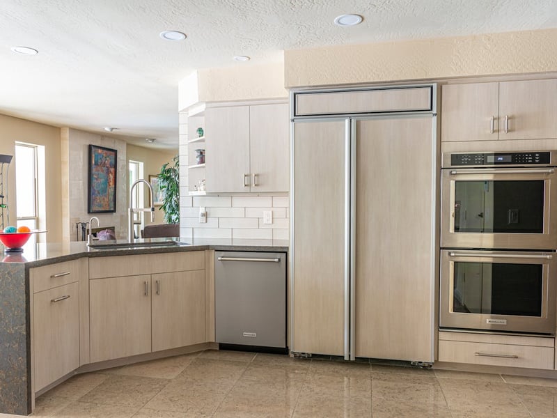
Flooring, cabinetry, benchtops, and tiles anchor the palette far more than paint. Once these are locked in, wall colours should respond to them, not compete.
This is where many buyers encounter frustration, particularly in pre-designed or house-and-land builds where selections are staged. Treating colour as an early coordination exercise avoids compromise later, especially where upgrades are limited or costly.
If a builder offers a structured colour consultation, its real value lies in this sequencing, not just access to samples.
Plan for cohesion, not uniformity
A well-chosen palette doesn’t mean every room looks the same. Variation can be achieved through tone depth, texture, and material shifts while still maintaining a cohesive thread throughout the home.
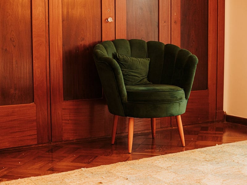
Homes that feel disjointed often suffer from over-customisation room by room, rather than a clear whole-of-house strategy. Buyers focused on long-term liveability and resale typically benefit from restraint upfront, leaving room for personalisation through furniture and styling instead.
The right palette supports how you live, and how the home holds up
Colour decisions are rarely irreversible, but they are disruptive and costly to change at scale. Homes that age well tend to prioritise adaptability over expression, especially in their foundational choices.
For buyers building or renovating, the strongest colour palettes are those that feel intentional without demanding attention, supporting daily life quietly, rather than defining it loudly.
Publisher Website: www.homeshelf.com.au