Pantone’s 2025 Colour of the Year, Mocha Mousse, offers a snapshot of the design mood shaping homes this year - warm, grounding, and quietly indulgent. The mellow brown hue, described by the Pantone Color Institute as “a flavorful brown shade… offering sensorial warmth and thoughtful indulgence,” reflects a collective desire for calm and connection in increasingly complex times.
Across Australian interiors, similar notes resonate. Dulux’s 2025 Colour Forecast, developed from global and local design research, leans toward palettes that balance nostalgia and optimism - Still, Recollect, and Emerge - all anchored by warm neutrals, earthy undertones, and muted hues that encourage reflection and comfort.
According to Dulux Colour and Communications Manager Andrea Lucena-Orr, these directions mirror a shift toward interiors that provide emotional refuge and simplicity amid the noise of digital life. While the pandemic years first sparked the “slow living” aesthetic, this year’s palettes deepen that sentiment - grounding spaces in tactility and tone, rather than ornament.

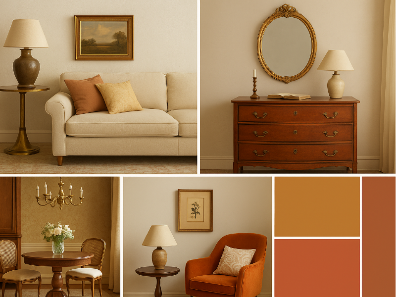
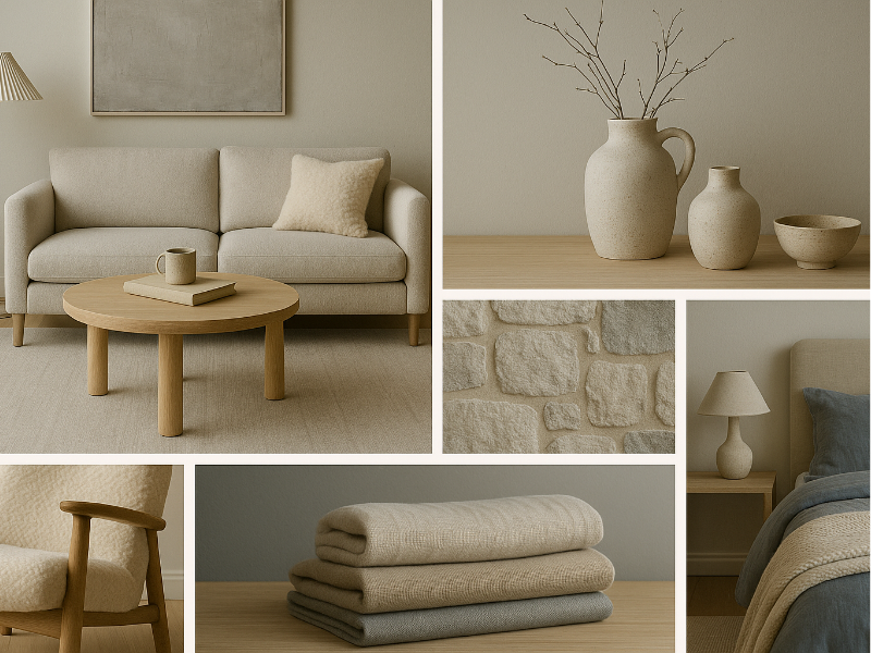
Mocha-inspired browns and clay-infused neutrals have evolved into the new foundation of home design. They complement natural textures such as timber, rattan, and stone, reinforcing the appeal of layered, sensory environments.
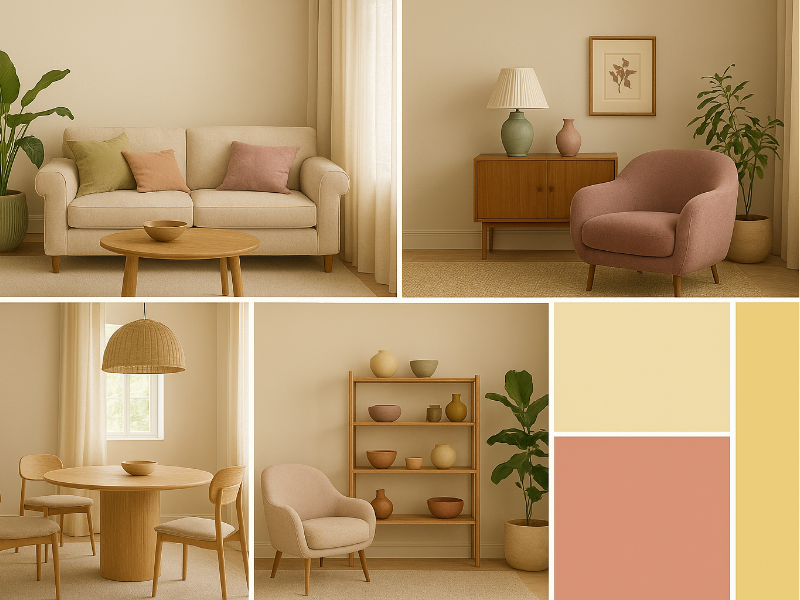
Designers are pairing these with greens and wine hues - the Recollect palette’s olive and burgundy tones, for instance - to add depth and a sense of nostalgia.

The overall trend isn’t about bold reinvention, but rather reassurance - spaces that feel collected, cohesive, and reflective of the homeowner’s rhythm. Whether expressed through a single feature wall in a warm neutral like Dulux Mellow Beige, or through an entire scheme wrapped in earthy terracotta and mocha, the result is the same: interiors that evoke comfort and connection.

For new builds, these colour directions offer a foundation that works across styles, from minimalist to coastal. For buyers, they hint at the growing preference for interiors that support wellbeing and everyday connection.
As Pantone’s Mocha Mousse suggests, colour in 2025 is less about making a statement and more about creating a state of being - a home that feels considered, comforting, and ready to evolve with its owners.
Publisher Website: www.homeshelf.com.au